
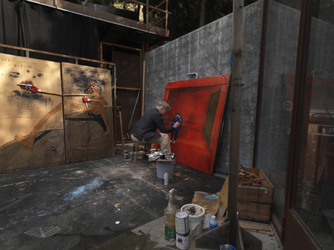
[Image: David Lynch in his studio ©David Lynch]
The film director David Lynch (b. 1946) started his career as an artist and trained at art school before switched to cinema. Since his youth he has made art and in recent years this art – painting, drawing, photography and other mediums – has been recognised in numerous exhibitions. The current exhibition David Lynch: Someone is in my House at Bonnefantenmuseum, Maastricht (30 November 2018-28 April 2019) brings together a wide range of Lynch’s fine art from his students years up until today. This exhibition is reviewed from the catalogue.
Interested in art from an early age, Lynch studied painting at Museum School, Boston in 1964 and transferred to Pennsylvania Academy of the Fine Arts, Philadelphia in 1966. At this more progressive institution, Lynch developed his ambitions as a creator. He recalled in an interview that while he was painting some grass, he imagined the grass being animated. This event was something that led him towards film. His first short films varied between animation, live action and a mixture of the two. Six Men Getting Sick (1967) was an animation projected on to a painted assemblage with plaster heads, which was filmed. It is the recording of the animated painting/assemblage that has become the film Six Men Getting Sick that we know today. From this point onwards, Lynch considered painting as an approach that could include sculpture, film projection, found objects and other material. These are not so much hybrid works as mongrel ones – crossbreeds of ambiguous appearance, uncertain origin, unclear taxonomy and undeniable vitality.

[Image: David Lynch, Six Men Getting Sick (1967), film still, courtesy ABSURDA]
In 1970 Lynch went to study at the American Film Institute in Los Angeles. At this point his creative energy was increasing focussed on films, such as The Grandmother (1970) then Eraserhead (1977, started 1972) – projects that occupied his time at the AFI and the immediate period after he left. There is relatively little large-scale work from around 1968 up until after 2000. At this time Lynch was busiest with directing. After 2006, the time when Lynch’s last feature film (Inland Empire) was released, art became his primary field of creativity activity again. It is fair to classify Lynch of recent years as more of an artist than a director, although his recent work on the third series of Twin Peaks showed he is still as original and masterful as he ever was as a director.
The early drawings are small, in pencil or ballpoint on standard size sheets of paper. These drawings of the late 1960s are typical of the period, working along the same lines as pop artists such as Richard Lindner and counter culture art, also art made in the wake of Surrealism. The mixture of pop culture imagery and subversive counter culture/underground attitude was common at the time. The art of Francis Bacon falls into this overlap. Lynch acknowledges Bacon as a major influence on his art, especially after Lynch visited Bacon’s exhibition at the Marlborough Gallery, New York in 1968. In the art (and also cinema) of Lynch we find the following Baconian elements: isolation of figures, predominantly dark background (from Bacon of the 1940s up to 1956), use of figural deformity, an atmosphere of emotional tension or distress, cages/tanks/frameworks as devices of confinement, use of drapes as backdrops, the eruption of carnal imagery, signs of violence, combination of domesticity and theatricality, the imperative of intense psychological trauma and the spectacle of sensation. Beyond the elements described above, it was the example of Bacon as an artist willing to explore the dark and alarming aspects of human existence in a striking, sumptuous and often beautiful manner in art that created a powerful impact which gave Lynch permission to explore his dark imagination in the area of fine art.
The placing of characters on a black ground (or immersed in darkness) is something common to Lynch and Bacon. Lynch has said, “Color to me is too real. It’s limiting. It doesn’t allow too much of a dream. The more you throw black into a color, the more dreamy it gets.” This is very apparent in the paintings of 1968 and 1988, as well as the later lithographs.

[Image: David Lynch, Woman With Tree Branch (1968), oil and acrylic on canvas, courtesy Rodger LaPelle and Christine McGinnis]
The large format of the paintings and expansive areas of black in them immerse us in darkness. Lynch wishes us to be consumed by the dark. Lynch is keen to keep in touch with the basic elements of existence: darkness, fire, smoke, soil, lightning, wood, water, oil, flesh. This matter prevents visions from becoming insubstantial or capriciously fantastical. This desire to keep material real is evident in the use of found objects and non-art materials which appear consistently in Lynch’s assemblage-constructions. The incorporation of found objects into life-size assemblage-paintings makes them similar to funk-art installations by Ed Kienholz. They certainly share a (critical) fascination with Americana, centring on the seediness of common culture.

[Image: David Lynch, Untitled (Lodz) (2000), archival pigment print, courtesy the artist]
Since the early 1970s, Lynch has taken photographs of abandoned industrial installations. He was inspired by the industry of Philadelphia and this inspirational encounter with artificial environments (contrasting so strongly with Lynch’s outdoors childhood in Montana and Idaho) carried over to the culverts and overpasses of Los Angeles which Lynch visited while at film school. These became the setting for Eraserhead. While on location in various places (including England and Poland), Lynch has recorded abandoned factories, warehouses, refineries, pumping stations and other buildings in black-and-white photographs. Some are included in this catalogue, though the photographs have previously been exhibited en masse and reproduced more extensively in other publications.
Uncanniness comes to the fore in a series of modified vintage erotic photographs. The original photographs were taken in the Nineteenth Century and have been republished since then. Manipulated by Lynch, the unclothed figures have become truncated, distorted and deformed. They engage in obscure activity, themselves obscure and sinister presences. They are ghostly – not dissimilar to spiritualist photographs of 1900-1920. These are the closest to deliberately nightmarish images, created to unsettle and disturb. In recent decades, Lynch has made a number of series of photographs of nude women. None of those photographs have been included in this exhibition.
There are two series of lithographs that Lynch has made at the Paris studio of Idem. The first was a series of abstract designs in three colours and was a short series; the second is figural and much more extensive – continuing intermittently to this day. The initial three-colour lithographs were derived from the post-it drawings of the 1980s. They have a Keith Haring feeling – a bit Pop, a bit graffiti, a bit graphic design. They are the sort of designs one would find on an inner sleeve of New Wave LP from 1989. They seem decorative and undirected. Lynch’s non-photographic art needs the compulsion of the figure, figural element or animal to be at its best. These lithographs (and related drawings) are the least successful of the series Lynch has made.

[Image: David Lynch, Someone is in My House (2014), lithograph, courtesy the artist and Idem Editions]
The later lithographs are much more successful. In 2007 Lynch stopped Lynch making colour lithographs and started drawing on stones using only black ink; the imagery included figures, animals, buildings and shadowy landscapes. This series has continued to this day. The prints employ the full range of artistic effects that traditional lithography is capable. Lynch has developed into a skilled lithographer, exploiting the capacities of stone lithography as a platform for his imagery. The sooty washes of ink diluted by turpentine make swirling clouds of dust and smoke. The scratching out of ink gives a graphic bite of light lines and provides relief to these dark scenes. The dabbing of fingerprints impart a touch of earnestness though not clumsiness and increase our engagement by adding tactility. As with other works, fragmentary phrases – be they snippets of dialogue or authorial commentary – appear in the pictures. These lithographs fit closely to Lynch’s large paintings in terms of appearance, imagery and tone. We witness incidents of violence and human contact (humorous, passionate, bizarre, inexplicable) in shadowy settings. These black lithographs are consistently the most effective pieces of art Lynch has produced to date.
In watercolours (primarily in greys and black) bleeding and soaking treat whole sheets of papers as objects. The scratching and abrasion of paper highlight the textural qualities of the materials. The watercolour Fight on a Hill (c. 2008-9) shares certain characteristics – not least the strange ambivalent tone somewhere between horrific thuggery and slapstick knockabout – with Goya’s Fight with Cudgels (1819-23) from his Black Paintings. Goya’s Black Paintings have a predominantly dark coloration and use of black, the artist’s use of grotesque and troubling imagery and ambiguity of subject matter all parallel Lynch’s ink drawings and lithographs. It seems that Lynch has few meaningful connections to contemporary artists and that his art has developed in relative isolation, with him exhibiting relatively rarely until the 2000s. Most of Lynch’s social and artistic milieu is centred on the film world rather than the fine-art world. It would be hard to assign Lynch to any current art movement.
Comedy plays an important part in Lynch’s creative output. This comes in the form of non sequiturs, colloquial dialogue or comments laced with underlying oddness or menace. There is a terrible form of black humour in scenes of catastrophic injury or deformity accompanied by laconic commentary. Part of the humour comes from the severity of the physical evidence and the mildness of the commentary. Often it is hard to judge the tone the texts – lacking context and verbal delivery – and this makes leaves viewers feeling wrong footed. The comic precision of titles such as This Man was Shot 0.9502 Seconds Ago (2004) recalls the baroque extravagance of Dalí’s titles.

[Image: David Lynch, Change The Fuckin Channel Fuckface (2008-9), mixed media on panel, courtesy the artist]
Another example of black humour is Change the Fuckin’ Channel Fuckface (2008-9), where a pathetic but sinister figure of a woman seated on a bed faces us and speaks. The text in the picture reads “woman with broken neck and electric knife speaks to her husband”. We are in a scene with narrative content. We are in the position of the husband, threatened by his angry and dangerous wife. Drawing an analogy with cinema is obvious but it seems a valid approach in this case. We have characters with emotional charge between them, dramatic tension, black humour, incidental details, a domestic setting and a degree of realism.
Lynch sometimes reaches for the cosmic. This can be seen in the films Eraserhead, Dune and The Straight Story. In his art it comes in the form of vortices and starry skies. His wastelands, perhaps inspired the Californian desert near Lynch’s home, also have a timeless quality. (The haunting isolation of the desert can be seen near the end of Lost Highway.) There is certainly work to be done by researchers on describing exactly how American Lynch is as a maker of fine art. In some respects he conforms to the stereotype of an American artist – a fascination with pop culture, American vernacular speech, imagery processed through the mass media, the American landscape, casual violence – and other respects he is a European artist in his ambiguity, his allusions to past art, evident fascination with deep existential horror and his refusal to accept simple answers. In this mixture, he is close to Abstract Expressionist behaviour, tastes and allegiances, though his art has little in common with theirs.
The abstract has appeared in Lynch’s films in the form of ambiguous spaces, starry skies, unknown terrain, water, fire and smoke. Lynch uses abstract elements in his cinema for reasons of pacing, atmosphere and symbolism. This carries over into his art. One only needs to think of the interludes in Twin Peaks series one and two, when see trees in the wind or a hanging traffic light against the night sky.

[Image: David Lynch, Boy Lights Fire (2010), mixed media on cardboard, courtesy the artist. Collection Bonnefantenmuseum]
How accomplished is the art here? Generally, the art is effective. Lynch is intelligent, thoughtful and resourceful and judges his art well. His proclivities are very individual and not every piece will please viewers – with some pieces too peculiar, forced, comic or macabre for viewers. There is art here that verges on the trivial. The drawing on the inside of matchbook covers (Lynch is a compulsive smoker) could also fall into this territory but they do not. The common imagery recurs but there seems greater attention and a willingness to reach an unexpected outcome.
One of the few direct connections to Lynch’s primary professional career is evident in the drawing on the front page of the first draft of Blue Velvet. The question arises: how does our familiarity with the films of Lynch influence our reading of the art? This is difficult to answer. If one knows the films and television of Lynch then one can find clear references in the art. The catalogue texts do not address the crossover between Lynch’s cinema and his art. This is probably wise. The important motivation behind presenting the art is to establish the seriousness of the Lynch as an artist and the nature and extent of his artistic output as an independent oeuvre.
For enthusiasts of Lynch’s films the links to his art are obvious. For example, Lynch from his earliest years not only enjoyed making props for his films but insisted on making materials for the films, treating the mise en scene as inhabitable paintings. The lamps in the exhibition are part of Lynch’s activity stretching back to Eraserhead, Elephant Man and Blue Velvet. The flickering lamp is one of the motifs of Twin Peaks: Fire Walk With Me, as found in the unwelcoming diner in Deer Meadow. The strobe effect has been a staple of Lynch’s imagery from the earliest years. Lynch made a short film of himself making a lamp in 2011. Even when Lynch the filmmaker had the funds to pay for expert prop makers, he chose to make his own, despite the heavy demands of directing. The dual practices of small-filmmaker as jack-of-all-trades and artist-as-director inform Lynch’s continuing desire to involve himself in prop making. Settings from Lynch’s films do appear in his art but those pictures have not been selected for this exhibition – perhaps because a curatorial intention to establish Lynch’s art as separate from his films.
As with his films, Lynch does not provide verbal interpretations of art works. Although he talks in general terms about how he works and his preferences, he eschews any discussion of the content of individual pictures. The catalogue authors do not examine specific works but write in general terms about Lynch’s art. That art is various, including prints (lithographs), original photographs (direct and manipulated), adapted vintage photographs, drawings, watercolours, oil paintings with assemblage, lamp sculptures and stills from films. Much of the art is undated, though it can be broken down into periods by style and material. Likewise, a fair amount is untitled.
There are a few slips in the catalogue. Idem Studio in Paris is repeatedly referred to as “Item Studio” and “Premonition Following an Evil Deed” becomes “…Evil Dead”. Generally, the catalogue is accurate and clear. The catalogue is a very informative and rounded view of Lynch’s activity as an artist and is likely to advance the cause of Lynch as an artist. Lynch is driven by deep fascinations and private engagements. The fact that this is clear in all of Lynch’s art, from adolescence to recent years, regardless of audience, demonstrates the seriousness of his practice. These are the hallmarks of a committed artist.
Stijn Huijts (ed.), David Lynch: Someone is in my House, Prestel, 2019, 304pp, fully col. illus., hardback, $65/£49.99, ISBN 978 3 7913 8470 2
© 2019 Alexander Adams
See my art and books here: www.alexanderadams.art
